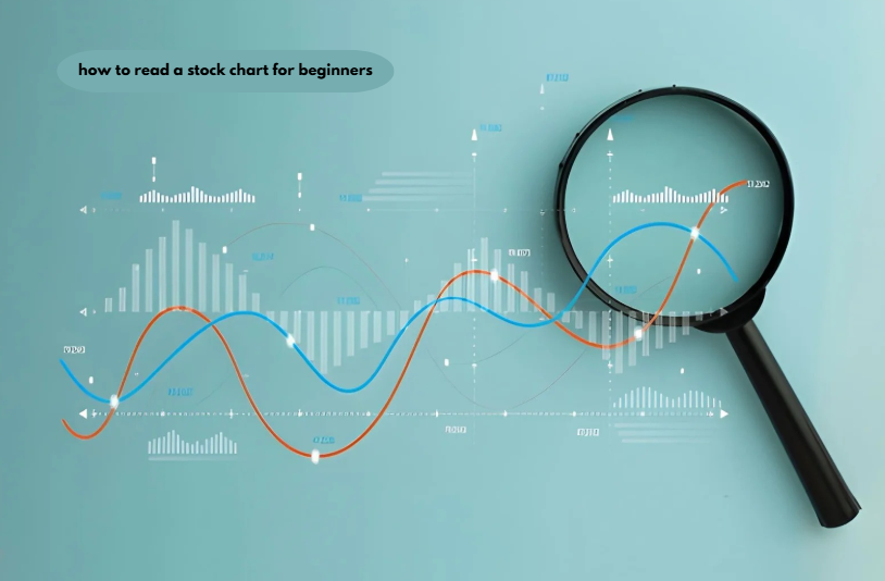
Learning how to read a stock chart for beginners comes down to three checks: the candlesticks show where price opened, peaked, bottomed, and closed; the volume bars show how many shares traded; and the trend shows the overall direction. Read all three together on a daily chart before acting.
Key Takeaways
- Each candlestick squeezes four prices into a single figure: the period’s open, high, low, and closing values.
- Candle color compares the close with that same candle’s open, not with the previous day’s close.
- A volume bar only carries meaning when it is measured against the stock’s own recent average.
- U.S. stock volume hit a record average of 19.32 billion shares a day in April 2025, according to Rosenblatt Securities.
- A 200-day moving average spans about 40 weeks of trading, which makes it a long-term trend gauge.
What is a stock chart?
A stock chart shows what a stock’s price has done over time. Price goes up the side; time goes along the bottom. Most charts also show volume, meaning how many shares were traded. Investors rely on them to spot a stock’s direction and the levels where its price has previously paused or rebounded.
How do you read a candlestick on a stock chart?
Each candlestick shows four prices for one time period: where the stock opened, its highest trade, its lowest trade, and where it closed. The wide section is known as the body, while the slim lines extending above and below are wicks, or shadows.
The body covers the gap between the opening and closing prices. On most platforms it turns green if the price closes higher than it opened and red if lower. The tip of the upper wick marks the period’s high, and the tip of the lower wick marks its low.
The format is commonly credited to Munehisa Homma, a Japanese rice trader, and Japanese analysts carried it into share trading after the country’s stock market started in the 1870s, according to the Corporate Finance Institute. The design lasted because one glance shows who won the session, buyers or sellers.
A worked example with real numbers
A candle becomes readable once you split it into three measurements. Take a daily candle with an open of $50.00, a high of $52.40, a low of $49.20, and a close of $51.80.
- Body: $51.80 − $50.00 = $1.80, colored green because the close beat the open.
- Upper wick: $52.40 − $51.80 = $0.60.
- Lower wick: $50.00 − $49.20 = $0.80.
- Full range: $52.40 − $49.20 = $3.20.
The body fills 56% of the range ($1.80 ÷ $3.20), and the close sits inside the top fifth of the day’s range. Buyers controlled most of the session and held their gains into the close. Flip the numbers so the close lands near $49.20, and the same $3.20 range shows sellers in charge.
The mistake most beginners make with candle color
A green candle does not mean the stock rose from yesterday. Color only compares the close with the open of the same candle.
Say a stock closes at $50.00 on Monday, opens Tuesday at $46.00 after bad news, and closes at $47.00. Tuesday’s candle is green because $47.00 is above $46.00, yet the stock lost 6% from Monday’s close ($3.00 ÷ $50.00).
The error happens because news apps color the daily change against the prior close, while charts color against the open. The fix is to check the gap, the empty space between one candle and the next, before reading the color.
What does volume tell you on a stock chart?
Volume is the number of shares traded during each candle, shown as vertical bars under the price area. It tells you how much participation sat behind a price move.
Compare each bar with the stock’s recent average, not the raw count:
- Above average: a stock that averages 1.2 million shares a day and trades 3.0 million on a breakout is running at 2.5 times normal (3.0 ÷ 1.2), which supports the move.
- Below average: the same breakout on 600,000 shares, half the average, deserves less trust.
- Market-wide surge: U.S. equity volume averaged a record 19.32 billion shares a day in April 2025, about 76% above April 2024, according to Rosenblatt Securities’ monthly volume report. In a month like that, a tall bar reflects the whole market, not news about one company.
How do you spot a trend on a stock chart?
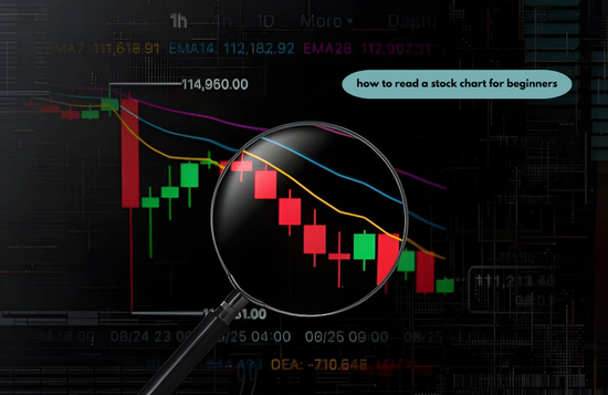
A trend is the direction price travels across many candles. An uptrend prints higher highs and higher lows, a downtrend prints lower highs and lower lows, and anything else is a sideways range.
Moving averages make the direction easier to see. A 200-day moving average adds the closing prices from the latest 200 trading days and divides by 200, a calculation Tradier Brokerage outlines in its technical analysis primer. With five trading days in a normal week, 200 days equals about 40 weeks, and a 50-day line covers about 10 weeks.
Price staying over a climbing average signals an upward trend. Price lingering under a declining average suggests a downward trend.
Support and resistance mark where trends pause. Charles Schwab’s Investing Basics lesson on technical analysis describes them as price levels a stock has struggled to break through. Support sits below the current price where buyers stepped in before, and resistance sits above it where sellers did.
Which chart timeframe should a beginner use?
Begin with the daily chart, then use the weekly one to verify the bigger trend. Shorter settings print more candles and more false signals.
The NYSE core trading session runs from 9:30 a.m. to 4:00 p.m. Eastern Time, according to the exchange’s published trading hours. That is 390 minutes, so a 5-minute chart prints 78 candles in one regular session while a daily chart prints one.
| Candle setting | What one candle covers | Candles produced | Best suited to |
| 5-minute | Five minutes of trading | 78 per regular session | Day traders timing entries and exits |
| Daily | One full 6.5-hour session | 5 per full trading week | Beginners and multi-week holders |
| Weekly | Monday through Friday | 52 per year | Confirming the long-term trend |
| Monthly | One calendar month | 12 per year, 60 over five years | Long-term investors reviewing history |
How to read a stock chart for beginners in five steps
Work from the big picture down to the single candle. This order stops one dramatic candle from overriding the larger trend.
- Set the chart to daily candles and a one-year view.
- Name the trend by checking whether highs and lows are stepping up or down and whether price sits above or below the 50-day and 200-day moving averages.
- Mark support and resistance with horizontal lines drawn through prior turning points.
- Read the latest candles for body size, wick length, and any gap from the prior close.
- Compare the volume bars with their average to confirm or doubt the move.
A chart shows what buyers and sellers did, not why they did it. Learning how to research a stock before buying fills that gap. Investor.gov, the SEC’s investor education site, points readers to the annual Form 10-K on EDGAR, which holds audited financial statements, risk factors, and management’s discussion of results.
The five steps apply to every category of stocks: value stocks priced low against earnings, income stocks bought for dividends, and passive stocks held for years with little trading. Whether an idea comes from a broker screener or a list of best stocks on a site such as 5starsstocks .com , run the steps before buying.
Measure each candle against that stock’s own history. A daily range that looks dramatic on a consumer staples or healthcare chart can be ordinary on an AI or cannabis chart, depending on how widely that share normally swings.
Chart reading is also only one part of how to build a stock portfolio for beginners. Deciding how much to put in each holding and spreading money across sectors comes first, and charts help with timing after that.
When the usual chart rules do not apply
Chart signals lose reliability on thinly traded shares and outside regular hours. With few trades inside each candle, one mid-sized order can create a long wick or a gap that reflects a single trader instead of the wider market. The NYSE runs separate early and late sessions around its core hours, and candles printed there come from fewer participants. For low-volume small caps, switch to weekly candles and treat a lone volume spike as unconfirmed until a second session backs it up.
Frequently Asked Questions
What do the red and green candles mean on a stock chart?
A green candle means the price closed above its open for that period, and a red candle means it closed below its open. Some platforms swap the colors for hollow and filled candles, so check the chart settings before reading a new platform.
What is the best chart timeframe for beginners?
The daily chart is the best starting timeframe because each candle summarizes one complete trading session. A weekly chart then confirms whether the daily move agrees with the longer trend.
Is high volume good or bad for a stock?
High volume is neither good nor bad by itself; it shows that a price move drew heavy participation. Heavy volume on a rising day supports the advance, and heavy volume on a falling day confirms selling pressure.
What is the difference between the 50-day and 200-day moving averages?
The 50-day moving average tracks about 10 weeks of closing prices, while the 200-day tracks about 40 weeks. The shorter line reacts faster to new prices, so it turns first when a trend changes.
Can beginners rely on stock charts alone to pick stocks?
No, a chart records price behavior but reveals nothing about a company’s earnings, debt, or business risks. Pair it with the company’s annual report, which Investor.gov says includes audited financial statements and risk factors.
Conclusion
Knowing how to read a stock chart for beginners means reading three layers in order: the trend first, the candles second, and the volume last as confirmation. A candle’s color compares the close with its own open, and a volume bar only matters next to its average. A chart tells you when buyers and sellers acted, and company research tells you whether the stock deserves your money.